Master Lock is in the process of developing a new Connected Lockout Tagout (cLOTO) platform to help companies ensure worker safety and OSHA compliance in industrial settings.
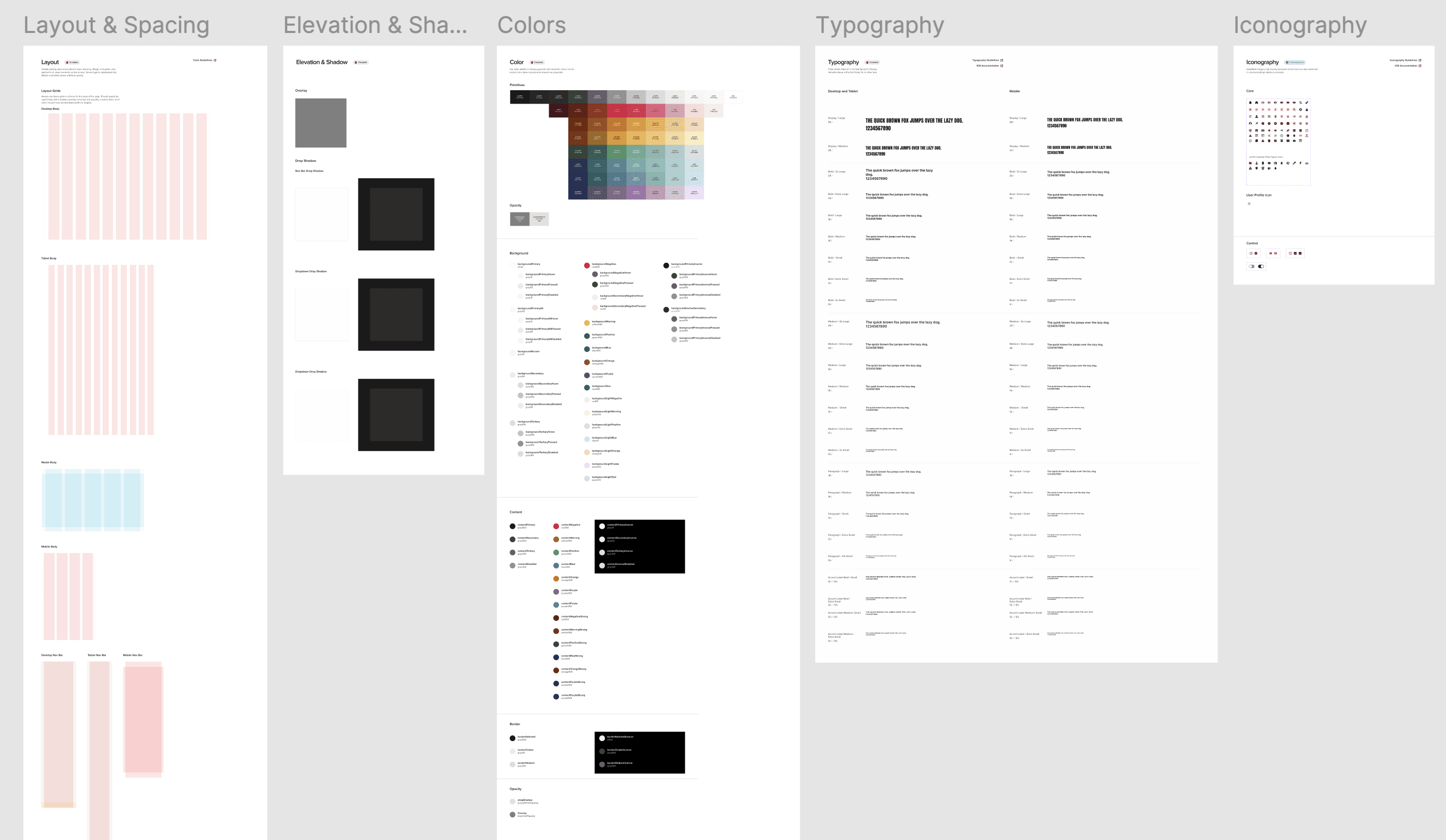
This is a completely new product for the company, and I created the design system for the related app entirely from the ground up, from layout and spacing to colors, typography, and iconography.
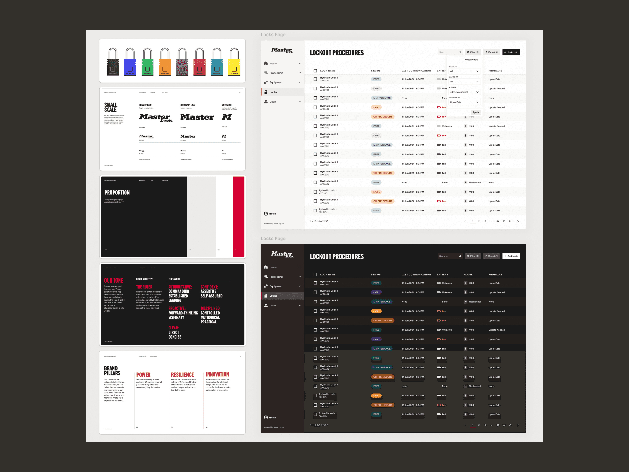
My goal was to establish a strong visual foundation that reflected the Master Lock brand while also supporting an accessible UI that scaled for complex enterprise workflows.
Year
2024
Team
While I was the lead for designing the foundations of the library, this project had 3 other product designers contributing to the components and design system. Cross functional team members included a product manager and an external engineering team.
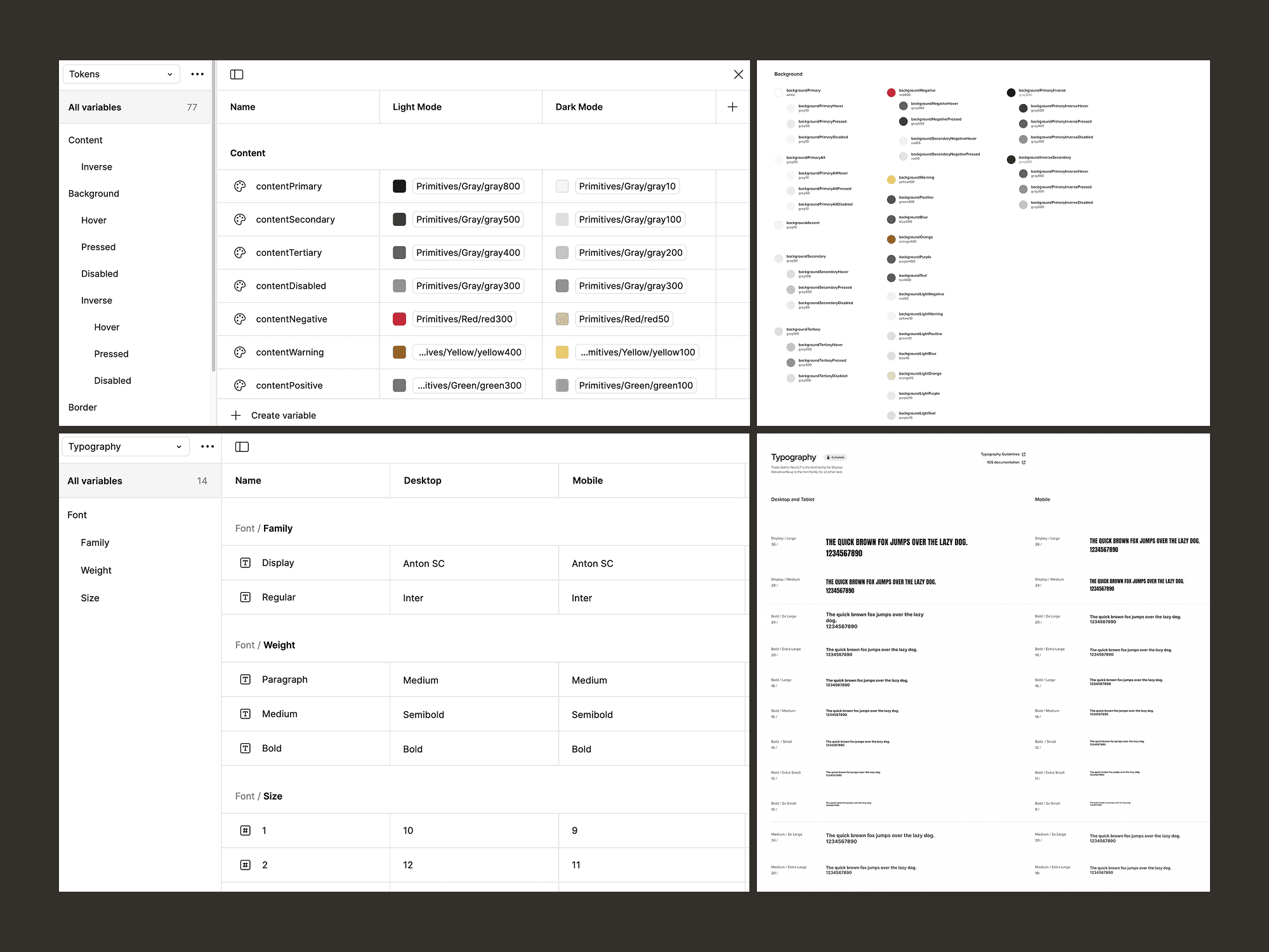
Using Figma variables for scalability
To ensure the design system could scale effectively, I used Figma variables to define color tokens with support for both light and dark modes. To make future adjustments quicker and easier, I also proactively created variables for typography elements (fonts, sizes, and styles) so they only needed to be updated in one place. This allowed us to iterate more quickly and avoid inconsistent implementation.
Balancing branding with accessibility
The Master Lock brand guidelines are heavily marketing-focused, but not the best fit for this app. To bridge the gap between branding and accessibility, I had to translate their bold, industrial aesthetic into a product-appropriate design system.
I focused on a clean foundation of white and primary black, using their Master Lock brand red as an accent.
To support accessibility and functionality—especially for things like status indicators—I introduced a carefully selected range of colors inspired by the hardware that pairs with the app. I opted for minimal border radii for buttons, icons, and controls to evoke a sense of strength and precision to match the Masterlock brand.
Outcomes
Scalable colors and typographical styles that match the brand guidelines but also provide enough options for an accessible software platform
A set of common icons that define the design language
A grid system to provide consistency but still allow for flexibility where needed